

If you are reading this, you are likely pretty aware of the (in)famous political compass test and all the media surrounding it. From the memes, to the endless testimonies on its (supposedly several) flaws, there is no lack of content about it. Now if you want to know what the political compass gets wrong or right about political ideology, this won’t really be the answer you are looking for. Not because I am not comfortable talking about politics, I can’t shut up about it, it’s just that there are far better resources by far more qualified people. This post though is about me examining how the test actually works, from an outside perspective.
Now let me give you guys the backstory. It literally started just as a shower thought, and I do mean literally. I kept thinking of all the different ways I have seen people criticize the compass, including a well pointed argument of the naivety of simplifying something like political ideology to just two dimensions. Another fun variation I have seen is people saying that actually it overcomplicates things by making up a new axis and that it should be one dimensional instead. It’s very funny, all corners of the political compass hate it, the only ones not caring about it are the centrists grilling in the middle, and since everyone hates centrists, that doesn’t really help the political compass. In my musings though, fueled by a few hours of scrolling through social media to get a dopamine boost, I realized I had no idea how the test works. Yeah, I know the general stuff about how you answer a given proposition and somehow, through some hidden scoring system, they give you a coordinate in their compass.
The question that remains is how do they take the given answers from each proposition and from there, come up with a coordinate? A lot of the criticisms of the political compass focus on the propositions and that is reasonable, after all, if the propositions are ill-posed, they cannot reliably give sound answers. However, assuming all propositions are sound, how are the economic and social coordinates determined? Like, often times, there are claims of the test being biased. But that is primarily determined by interpretation (if you think for instance that, I don’t know, George Bush was far left, you may say the test is biased against conservatives and that it says everyone is a Nazi), which is valid, but again we would just circle back to propositions. Since the test gives up a numerical value, there must be a way, deterministic hopefully, for that value to be determined. Which means, we should be able to find it. But how?
I will now try to guide you through my journey. If this was a scientific article, the first thing I should do is to go look for bibliographic research. Maybe someone tried to crack this thing before me. Maybe the people behind the political compass have a public statement about it. Anything that would just answer my question quickly without needing too much effort on my part. But since I am a “hack and a fraud“, I decided to do things with my own hands (rather I forgot to do that, and only remembered it was a possibility 4 hours into the website’s code). At the end of this post, if I remember I will go look for any kind of information on the subject. Now onto the task. First let’s try to frame this in as clear of a way as possible.
The political compass is a test comprising 62 propositions divided into six parts, covering general subjects about worldviews, the economy and society in general. According to the folks who made the test, the propositions come in all flavors, both moderate and extreme, and should be answered without much thought, essentially these should reflect your beliefs and not what would be the most rational choice. Rationality is not the point, they say. Each proposition has four options, representing different levels of agreement from “Strongly disagree” to “Strongly agree“, with no possible neutral option, which is an interesting choice. That makes my efforts more difficult, because I have no reference point from which to start. Because of the way that the questions work, we essentially have a 62 dimensional space with each dimension corresponding to a proposition, and the variables are ordinal categorical, meaning they represent categories that can be ordered by level of agreeableness.
I could say I can just use all of the possible answers and that would give me a 1-to-1 map of all the coordinates and all the possible answers, unfortunately that is not feasible, because since we have 62 propositions with 4 options, that gives a nice and pretty substantial 4⁶² options to choose from. That‘s around 10³⁷ possible answer lists. That’s more combinations than drops of water in the ocean. So that’s a hopeless search. However, that doesn’t mean we can’t say anything about this map. Naturally something that takes 62 different values and outputs 2 is going to be very complicated, but there are some properties that these maps could follow. The first rule that we expect is that if we give the same input to this map, it gives us the same output. Imagine, that in one day, you answer “strongly disagree” to everything, and you get put in the Lib-Right corner. And the next day, you give the exact same answer and you get Authoritarian-Left instead. Naturally, that test would be worthless.
Some people will say it already is, but, for you guys, it would be even more worthless. Meaning that we want the same answer to give us the same coordinate. If a map satisfies this property, we call it a function. Now functions are everywhere around us, because they are very convenient and behave reasonably well, at least compared to the other maps. The thing about functions is that they actually can be further classified. We have talked about how functions map each input to exactly one output. But can 2 (or more) many inputs map to the same output? Let’s consider the function f(x) = x². Both -1 and 1 are inputs that give the same output, 1. So what we are trying to find is whether or not our function is one-to-one (injective), or many-to-one. The expectation we have is that it should be, because even if there are 4⁶² points, the coordinates are real-valued between -10 and 10. There are infinitely many choices there and infinity is larger than 4⁶². But, that may not necessarily be the case, because it assumes all propositions are independent from each other. Now I want you to consider the following propositions
I’d always support my country, whether it was right or wrong
No one chooses their country of birth, so it’s foolish to be proud of it
We can’t deny that those propositions are different. But are they independent? Would someone who strongly agrees with the first one, also agree with the second? While I can’t confirm or deny that, it’s extremely unlikely. If two propositions are independent, then knowing how someone will answer one proposition tells us nothing about the other ones. But the political compass quiz is filled with propositions that are quite linked or correlated, like the two examples above. Even though a naive interpretation of the numbers suggests to us that the function could be injective, there’s also a strong likelihood it isn’t, because of the strongly correlated propositions. (Let’s not talk about surje*****ty, it’s not worth it)
To test the map, I will choose a couple of points with a well defined meaning to figure out the method. I will represent the 62 propositions as a vector, where each input will correspond to an integer between 0 and 3 (where 0 is “Strongly disagree” and 3 is “Strongly agree”). In this case when I say I used the point [0, 0,…, 0], what I mean is that I answered “Strongly disagree” to all propositions. So the simplest approach to probe the test will be to use the points x0 = [0,..,0], x1 = [1,..,1], x2 = [2,..,2] and x3 = [3,..,3]. For one thing, if the propositions are balanced across both the economic and social axes, then we expect it to be symmetric and centered at the point (0, 0) in the compass. Additionally if there is some displacement between points in proposition space that is translated to an equivalent displacement in coordinates, then an equal displacement in the proposition space should correspond to an equal displacement in the coordinate space. This second property we are probing for is linearity.
Of course, the distance between points in the coordinate space is straight forward, just use your regular euclidean metric. But in the proposition space things are a bit murkier because of the whole agreement being a categorical variable, not a numerical one. However, as we have seen with the vector representation, because agreement in this test is an ordered variable, we can use a distance measure that counts steps, like Manhattan distance, defined as follows
where k is just a shorthand for the numbered propositions (a23,0 is the digit in position 23 for point x0 or the proposition 23 answered with “Strongly disagree”). You may also notice from this that the points are equally spaced from each other in the following order:

With a distance of 62 units. Therefore the difference in the coordinate space should be equal as well. However here are the results for the different points:

Not only are the results not centered when agreeing or disagreeing with all the propositions, but the change between the levels of agreement is not linear. If we consider the “strongly disagree” category, the outcome suggests there is an imbalance between libertarian and authoritarian propositions, with the excess edging towards the authoritarian side. At the same time, the different relative balance between strongly and slightly held beliefs for agreement and disagreement suggests that different propositions may hold different weights. This already gives us some intuition on the behavior of the algorithm. This is how the trajectory looks in the political compass:

Now I will be focusing on the “strongly disagree” point. There is something else I am interested in clarifying. Whether each proposition is scored independently, and if the propositions have a score in a single axis or on both axis. And for this, we will use the six propositions of the last part of the test, which looks at statements concerning sexuality. Using DevTools in any particular browser, we can see that all propositions are linked to variables. In Firefox, the browser I used, you had to go to network, and then select the last POST method transferred, and look at the Request section:

There, we find the variables storing the economic and social scores of the previous page, as well as the answers to each proposition of the previous page, which were represented as 0, 1, 2 and 3 respectively. For part 6, the propositions were represented by the variables "sexoutsidemarriage", "homosexualadoption", "pornography", "consentingprivate", "naturallyhomosexual", and "opennessaboutsex", or let’s call them p1 through p6, for convenience. So, I change the answers from “Strongly disagree” progressively, until we reach “Strongly agree”, and track how the coordinate changes for the different propositions.
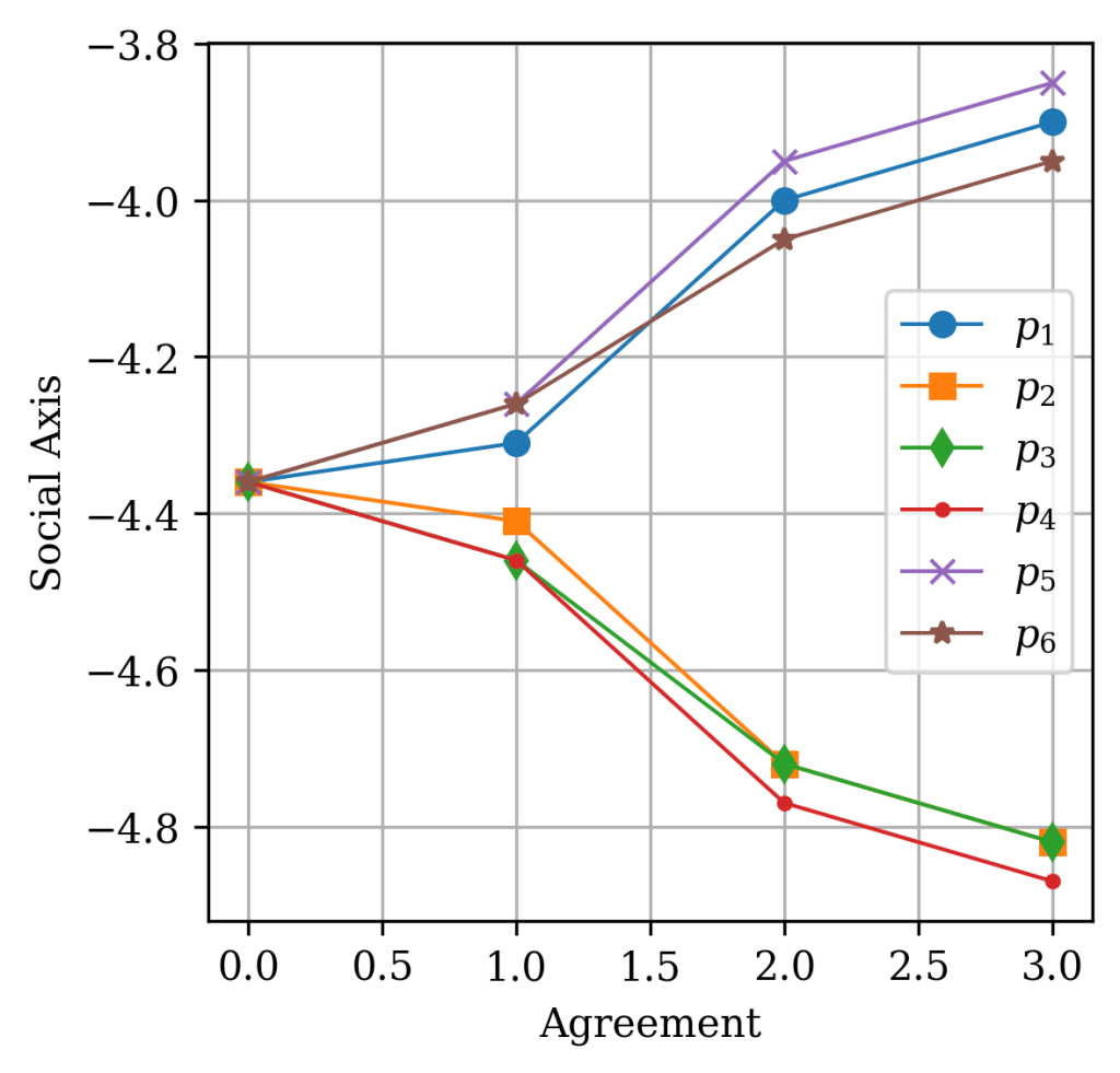
We can see according to these images the following observations. Going from “Strongly x” to “Slightly x” only shifts the coordinate by at most ± 0.1. But between the “Agree” and “Disagree” choices, the jump is larger. At least, variation in function of agreement is monotonic.
Based on this observation it seems that the axes are isolated, with propositions only influencing either the social or economic axis. Some propositions have equal weight in magnitude and opposite effects in the coordinate. In theory, if there were an equal number of these, they would cancel each other out. Which suggests, there is an equal number of propositions leaning left or right in the economic axis, and they cancel each other in the scores. Additionally, there is a net bias on the propositions associated with the social axis. While there is a nonlinear value mapping, the mapping for values of each proposition is independent from the mappings of other propositions. Which implies that the coordinate is a superposition of scores for individual propositions.
To check if this wasn’t an artifact from starting at (x0), I repeated the test for x3 when changing the statements of part 6. It gave the same results shifted to the positive side, so I didn’t bother to put the graph here. You can check it for yourself if you don’t trust me.
Something else you might see from the previous screenshot is that the social coordinate is not stored with the same value you see in the final compass, but instead as an integer score. To hit the coordinate of -10 in the social axis, you need an internal score of -195 points, so there is clearly some normalization going on behind the scenes. For the economic axis, the interval is between -80 and 80. So there is a significant order of magnitude difference between the scores of economic propositions and social propositions. A one-point change in the economic axis shifts you by 0.125, but the same change in the social axis only causes a shift of around 0.0513, about 40% as much. This balance might be compensated by the number of propositions distributed for both axes. So probably, social propositions outnumber economic propositions roughly 2 to 1.
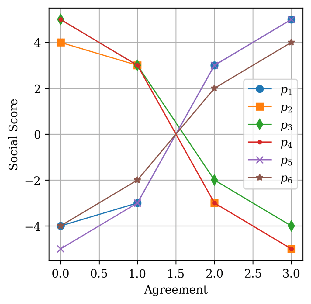
If we convert the variation of coordinates into variation of scores, we see that there is anything between an 8 to a 10 point difference between “Strongly agree” and “Strongly disagree”, which suggests that the scores are probably between -5,-4, 4 and 5, depending on whether the interval is of 8, 9 or 10 points. For 8 or 10 points, we may use an argument of symmetry to infer that the starting value for “Strongly disagree would be ±4 and ±5 respectively. Things get a lot messier when there are intervals of 9 points, as there is now an asymmetry. One side will have a stronger weight than the other (either 5 relative to -4 or -5 relative to 4). Below we show a similar plot to the previous one showing displacement in the compass, now represented by their integer score.
The final point I would want to address is how many extra authoritarian statements do we have relative to non-authoritarian. Just to remember, our coordinate position for x0 was (0,-4.36) corresponding to an internal social score of -85. Given that the extreme values of agreement are typically -4 or -5, there is a certain number of possible combinations that would give us this score.

Here n and m are just integers that satisfy this equation. If we were to plot all of the possible points and as well as the total number of propositions needed, we get the following graph

Either way, these results tell me that the absolute number of propositions we need for the score obtained is between 17 and 21 (on average around 19). Given that we should have roughly 40 social propositions, that means there are at least 17 authoritarian leaning propositions, not counting the ones that are canceled by the libertarian leaning propositions. With back of the envelope calculations, I’d bet authoritarian propositions outnumber libertarian propositions about 3 to 1.
After all this, what is left? The simplest way I can read this model is that the 62 propositions work like weights on a bar. And the levels of agreement you have is where you are putting the weights on this bar (at an edge or closer to the middle, on one side or the other), and your score is like your center of mass. Unfortunately the propositions either fall down completely into the economic or social axes, which is an odd decision, since many of the propositions could be economic and social. But based on my observations, the simplest model they could make is one where the propositions are associated with a single axis. Any further and questions would be raised about the appropriate weight given to each axis, and increase the challenges of the test exponentially.
Now after all this step, what has there been done in the literature? This political compass seems to be just the latest iteration in the group. Apparently one of the first compasses was the Nolan Chart, introduced by David Nolan, in a paper titled “Classifying and Analyzing Politico-Economic Systems” in a paper oddly named The Individualist. I couldn’t find anything about that paper to be honest, but, for additional context, he was one of the founders of the American Libertarian Party, inspired by authors like Ayn Rand, among others. Before continuing, be warned, I will be showing the Nolan Chart as he originally published it in his paper (should I even call it a paper btw?)

This might give you a stroke, but in case it didn’t, you can really see the resemblance to the modern compass. The social axis is flipped upside down, but in Nolan’s words, it is meant to represent “Percentage of personal freedom”. There are some amazing details here, hilarious even, but this is not a review of the political compass itself. It is just funny seeing Nazis as left of center. I want to talk about the diagonal lines though, as well as the lens shape. The middle that goes from the “Left” corner to the “Right” corner is supposed representing the Overton window, or the traditional “Left”-“Right” 1D political spectrum which according to Nolan could be boiled down to hippies vs segregationist. I am oversimplifying, but you can read the paper for a more fair assessment. The other big diagonal, Would basically represent the total amount of “freedom”, which he says is the most consistent political alignment. The smaller diagonals, would then further divide the diagram, as “statist”, “mixed” and “autonomists”, in ascending order. The lens shaped region interestingly is part of a claim by Nolan, that most political alignments occurs inside of that region, so you can consider it the most probable zone of occupation.
After this sensory overload, let’s ignore the fact that Nolan didn’t really make any verified claims, and go back to our own political compass. Well, looking at the literature, I have not seen any particular article of note where there are exploration of the methods behind the political compass. I will preface this by saying that I am not someone from the social sciences, so a lot of the nuanced discussions on the topic will be beyond my scope. But there are some interesting examples, I have found. An article from 2019 by Fabian Falck et al, Measuring Proximity between Newspapers and Political Parties: The Sentiment Political Compass, published at the journal Policy and Internet, analyzed the political bias of some newspapers towards some political parties during the German federal elections. They used a data-driven approach by scanning over 100 thousand newspaper articles, tracking both the parties covered, and the context in which they were being covered, whether negative or positive. It’s worth mentioning that they weren’t trying to find where the newspaper sit in a political compass, but rather how the coverage of news across the political landscape of German politics changes for each one. Now, given where there would be negative or positive bias, that would change the relative position of German newspapers. This landscape is defined by the position of the parties in the political compass, so there are arguments one could make that there is an intrinsic flaw. But I would argue that does not invalidate their results as the landscape can itself be real just have a different distribution, it does not change the fact that for instance there is a strong bias in the political leaning of newspapers in German, a bias also reflected in their political parties. Of course, contrary to the authors I am not politically neutral, so I can say that things in Germany are not looking good, and the last time the newspapers pilled-up in the Auth-Right corner, history didn’t end on an high note.

Now to wrap this thing up, I guess I should get a bit serious. As a STEM guy who is particularly interested in social dynamics, the political compass is something I try to approach with particular caution, as the possibility of a two-dimensional political space introduces the possibility of modelling political progression. And modelling anything is very tempting when you are educated in the principle that there is an underlying logic, a simple rule that describes any particular process. There are often claims which are stated as fact, without a strong backing like “People getting more conservative as they get older”. If the political compass could be used for that, a study could be conducted where individuals would be followed for decades, taking the test every few years, and keeping track of their results. However, as times advance, the propositions which are contentious today become common sense in the future, things that are common sense today become transgressive, and the political landscape changes. If the test must change to adapt to the new questions of its time is it even reliable? That’s just something to think about.
Do I think the test is useless? Not quite. While I do agree that the propositions are often confusing and that the weights and biases might be odd, the framework itself is not bad. Just not for individuals, which can have wildly different and inconsistent positions at once. For groups, populations, to show generalized trends within a social body, those could probably work much better as positions are more consistent and propositions could be directly compared to policy. In a way, it’s kinda like political ideology, you can’t really talk about it, unless there is a group who believes in it. As for the title of this post, I don’t think I cracked the political compass, this is enough for what was supposed to be an afternoon work. But well, at least I hope you had as much fun in this journey as I did.
